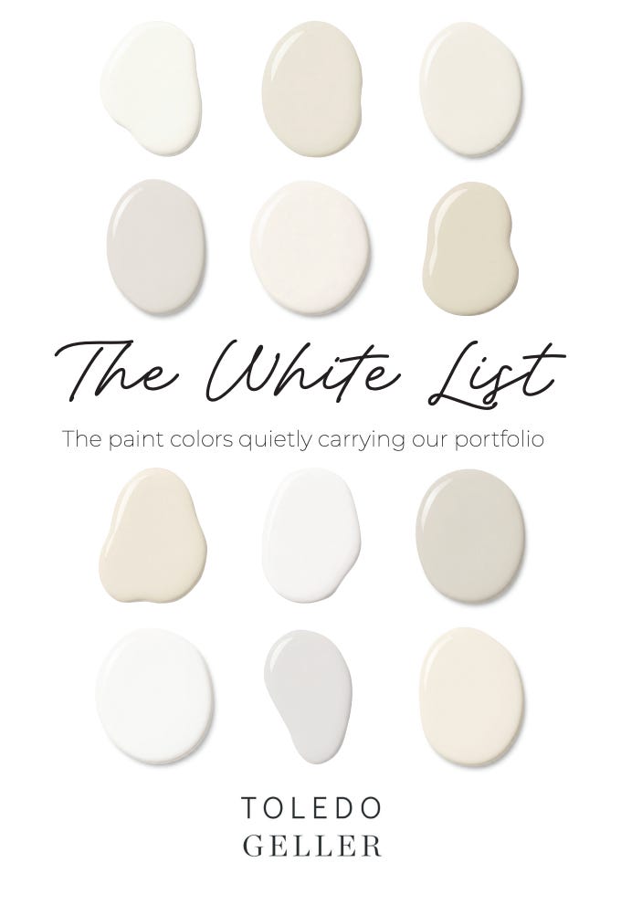
The White List
A designer’s cheat sheet for the white paints we actually use (with photos).

There is something uniquely unhinged about choosing white paint.
At first it sounds simple. White is white, right? And then suddenly you are standing in the middle of your living room holding six nearly identical paint chips while whispering things like, “This one feels… musty?”
We get asked about white paint constantly, and while there is no one-size-fits-all answer, there are certain shades we come back to over and over depending on the mood of the home, the lighting, and the architecture.
These are the whites that have earned permanent spots in our rotation:
Simply White
We often find ourselves turning to Simply White - perhaps because the name itself makes everything feel… simpler. But really, it’s because this color somehow manages to be incredibly adaptable. It feels fresh and bright without being stark, and has enough warmth to keep spaces from feeling cold.
Case in point: these two projects are both Simply White, and they could not feel more different. One lives in a sun-drenched beach house with soaring ceilings and natural light pouring in from every direction; the other sits in a cozy Tudor with 8’ ceilings and a completely different mood. Same paint. Different personality.
Which is our gentle reminder that paint colors are wildly influenced by architecture, light, ceiling height, and surroundings. And why copying a color from Pinterest is never quite as straightforward as we wish it were.


